自用butterfly外挂标签说明书
参考文章:

安装插件
查看安装步骤
在博客根目录打开终端
1 | npm install hexo-butterfly-tag-plugins-plus --save |
替换hexo自带的markdown
1 | npm uninstall hexo-renderer-marked --save |
添加配置信息
在主题配置文件_config.butterfly.yml中添加
1 | # tag-plugins-plus |
参数说明
| 参数 | 备选值/类型 | 释义 |
|---|---|---|
| enable | true/false | 【必选】控制开关 |
| priority | number | 【可选】过滤器优先级,数值越小,执行越早,默认为10,选填 |
| issues | true/false | 【可选】issues标签控制开关,默认为false |
| link.placeholder | 图片地址 | 【必选】link卡片外挂标签的默认图标 |
| CDN.anima | URL | 【可选】动画标签anima的依赖 |
| CDN.jquery | URL | 【可选】issues标签依赖 |
| CDN.issues | URL | 【可选】issues标签依赖 |
| CDN.iconfont | URL | 【可选】iconfont标签symbol样式引入,如果不想引入,则设为false |
| CDN.carousel | URL | 【可选】carousel旋转相册标签鼠标拖动依赖,如果不想引入则设为false |
| CDN.tag_plugins_css | URL | 【可选】外挂标签样式的CSS依赖,为避免CDN缓存延迟,建议将@latest改为具体版本号 |
外挂标签语法
行内文本样式text
查看行内文本样式text语法
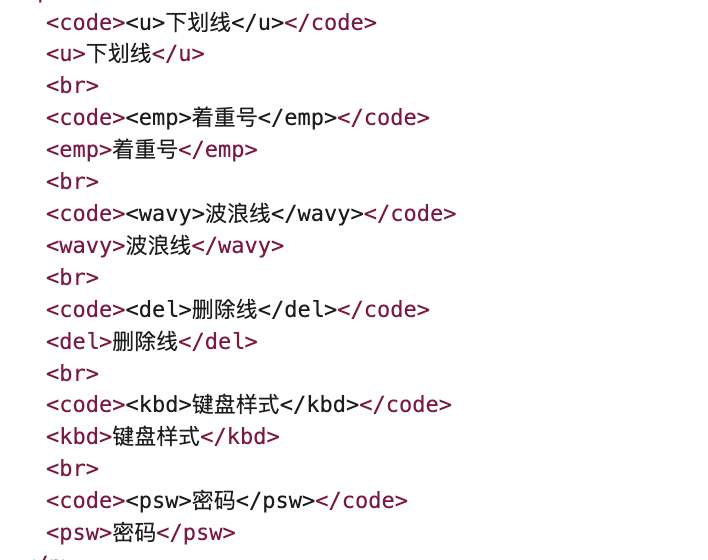
1 | {% u 文本内容 %} // 下划线 |
<u>下划线</u>下划线<emp>着重号</emp><wavy>波浪线</wavy><del>删除线</del>删除线<kbd>键盘样式</kbd>键盘样式<psw>密码</psw>
行内文本span
查看行内文本span语法
1 | {% span 样式参数(参数以空格划分), 文本内容 %} |
样式参数中的内容都会被放到span的class属性中,可配置的信息如下
- 字体: logo, code
- 颜色: red,yellow,green,cyan,blue,gray
- 大小: small, h4, h3, h2, h1, large, huge, ultra
- 对齐方向: left, center, right
1 | {% span fa fa-home green large center,云横清岭 %} |
渲染结果
云横清岭
页面element

p标签,段落文本
查看段落文本p语法
1 | {% p 样式参数(参数以空格划分), 文本内容 %} |
样式参数中的内容都会被放到span的class属性中,可配置的信息如下
- 字体: logo, code
- 颜色: red,yellow,green,cyan,blue,gray
- 大小: small, h4, h3, h2, h1, large, huge, ultra
- 对齐方向: left, center, right
1 | AAA{% p fa fa-home red h1 left,BBB %}CCC |
样式预览
AAA
BBB
CCC页面element

note标签,提示框
note标签示例
查看note标签详情
修改主题配置文件
1 | note: |
Note标签外挂有两种用法。icons和light_bg_offset只对方法一生效。
1 | {% note [class/color] [自定义icon/no-icon] [style] %} 内容 {% endnote %} |
参数详解
| 参数 | 用法 |
|---|---|
| class | 【可选】标识,不同的标识有不同的配色( default / primary / success / info / warning / danger) |
| color | 【可选】标识,不同的标识有不同的配色( default / blue / pink / red / purple /orange / green ) |
| no-icon | 【可选】不显示 icon |
| icon | 【可选】可配置自定义 icon (只支持 fontawesome 图标, 也可以配置 no-icon ) |
| style | 【可选】可以覆盖配置中的 style(simple/modern/flat/disabled) |
示例
默认提醒框
// 以下参数自带颜色和图片
default
primary
success
info
warning
danger
// 自定义颜色
blue
red
// 自定义图标
red fas fa-fan
blue fas fa-fan
// 自定义note的风格
primary 默认
primary simple
primary modern
primary flat
primary disabled
tip标签,上标
tip标签示例
查看tip标签详情
tip标签语法
1 | {% tip [参数,可选] %}文本内容{% endtip %} |
配置参数
- 样式: success,error,warning,bolt,ban,home,sync,cogs,key,bell
- 自定义图标: 支持fontawesome。
示例
1 | {% tip %}default{% endtip %} |
样式预览
anima,动态标签
效果演示:
动态标签的实质是引用了font-awesome-animation的css样式,不一定局限于tip标签,也可以是其他标签
anima标签语法
1 | // 整个提示框的动画 |
参数:动画时机
| 动画时机 | 动画时机说明 |
|---|---|
| animated | 页面加载后 |
| animated-hover | 鼠标悬停时 |
参数:动画速度
| 动画速度 | 动画速度说明 |
|---|---|
| 无 | 默认速度 |
| faa-fast | 快速 |
| faa-slow | 慢速 |
参数:动画类型
| 动画类型 | 动画类型说明 |
|---|---|
| faa-wrench | |
| faa-ring | |
| faa-horizontal | |
| faa-vertical | |
| faa-flash | |
| faa-bounce | |
| faa-spin | |
| faa-tada | |
| faa-pulse | |
| faa-shake | |
| faa-tada | |
| faa-passing | |
| faa-passing-reverse | |
| faa-burst | |
| faa-falling | |
| faa-rising |
示例
// On DOM load(当页面加载后显示动画)
1 | {% tip warning faa-horizontal animated %}warning{% endtip %} |
warning
// On hover(当鼠标悬停时显示动画)
1 | {% tip warning faa-horizontal animated-hover %}warning{% endtip %} |
warning
// On parent hover(当鼠标悬停在父级元素时显示动画)
1 | {% tip faa-parent animated-hover %}<p class="faa-horizontal">warning</p>AAA{% endtip %} |
warning
AAA// 调整动画速度
1 | {% tip warning faa-horizontal animated %}默认速度{% endtip %} |
默认速度
faa-fast
faa-slow
checkbox,复选列表
演示效果:
plus red checked
blue
times red checked
checkbox标签语法
1 | {% checkbox 样式参数(可选), 文本(支持简单md) %} |
checkbox配置参数
- 样式: plus, minus, times
- 颜色: red,yellow,green,cyan,blue,gray
- 选中状态: checked
checkbox示例
1 | {% checkbox 纯文本 %} |
纯文本
支持简单的 markdown 语法
设定颜色
checked plus red
radio,单选列表
演示效果:
red
blue checked
radio标签语法
1 | {% radio 样式参数(可选), 文本(支持简单md) %} |
radio配置参数
- 颜色: red,yellow,green,cyan,blue,gray
- 选中状态: checked
timeline,时间轴
演示效果:
timeline标签语法
1 | {% timeline [时间线标题] [,color] %} |
timeline配置参数
timeline示例
radio示例
1 | {% radio 纯文字 %} |
 微信
微信 支付宝
支付宝